Feedback (copied from Pearls blog):
Over all the group thought the 3D hand crafted approach was working well and would appeal to our target audience. However they had concerns about the 4D idea ( a set of posters/billboards/ 3d display), If we are to make the drink famous, every poster should include the branding of the drink. They thought the below image was working the best and the hand crafted text poster wasn't needed. The holiday theme should be more dominant through out all posters, as this is the feel good association. Perhaps a different holiday for each drink ie (orange-sunny beach, sparkling lemon - city brake, cranberry- romantic holiday, purple- skiing)
I can't help but think that the concept wasn't communicated properly as this feedback isn't particularly relevant to what we was doing, however, I have taken this on board.
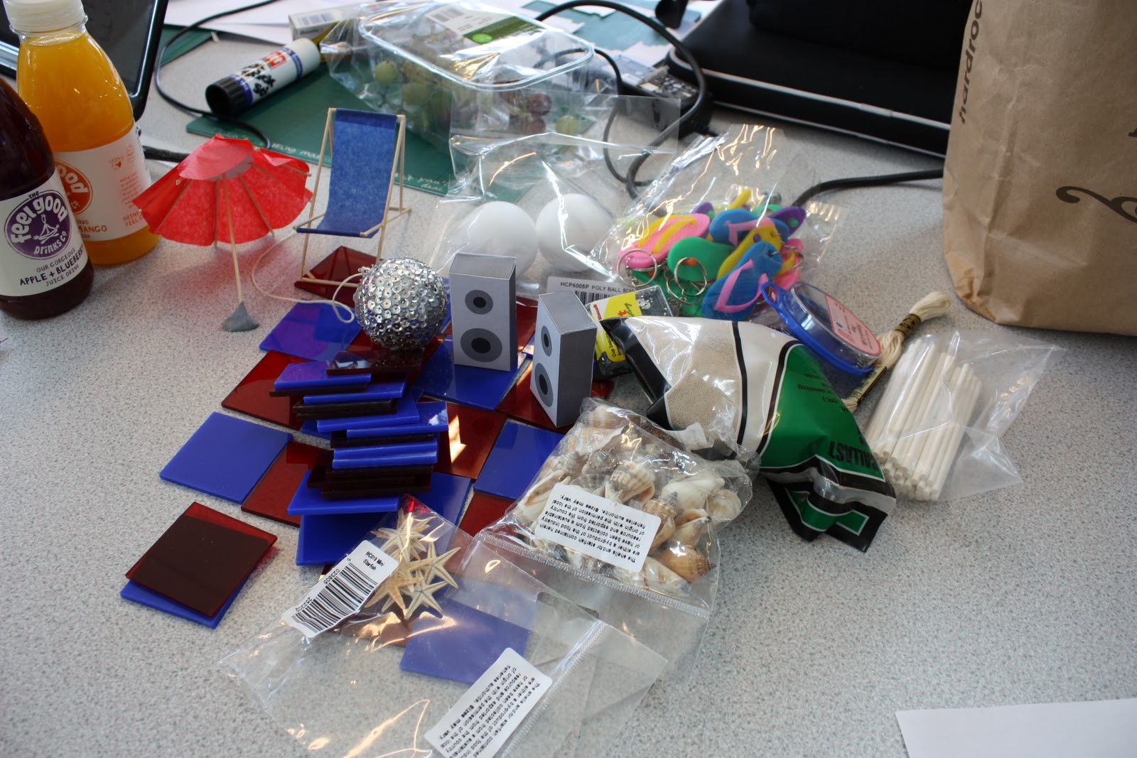
We are now creating a scene for the drink alone, without the use of typography. This means that the 4D installation is no longer relevant and will now be just the one poster situated throughout train stations and bus stops. The scene will still be 3D however wont be created through the use of paper craft. I have taken a trip to Hobbycraft and bought sand, shells, sequins, and a lot of other stuff, in order to try and make the scene seem as realistic as possible.
It's disappointing that such a drastic change has to be made at the last minute, but I do feel that this will be a much more fun and exciting way to promote the drink, which is what we were aiming for in the beginning.
Stuff I bought from Hobbycraft:

The disco ball I made, created with a polystyrene ball and sequins. Along with laser cut pieces of perspex to create the dance floor.


No comments:
Post a Comment