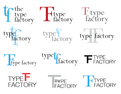
Carrying on with the TF experiments.
The top two lines, with the lower case experiments, feels too elegant and doesn't represent a Type Factory very well. I do really like the last experiments, however, after playing around with these for a while I began to realise that I'm not sure this is the direction I would like to go in.
So, I thought I'd play around with how it would fit with the text.


No comments:
Post a Comment