Serifs

Sans Serif
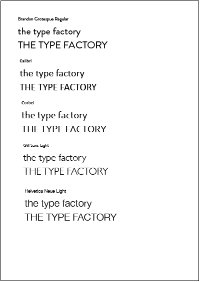
I'm focussing towards the serifs at the moment as it seems more traditional considering the subject. However, the sans serif is more industrial and I do like it. I'm going to leave this fairly open for now and see where my design direction takes me.
The idea of having the font being a sketch showing the construction of type is a great way to communicate the subject.
This font is Tusj, found here.

The only problem is, when it's downscaled, the details are barely visable. This would be suitable for large signage on the building and posters, but when it comes to the leaflets, it won't be seen. Though it will still be legible.


No comments:
Post a Comment